
ArcGIS StoryMaps feel like peak digital humanities. Certainly when you watch Esri’s introductory event – “Live from Silicon valley, it’s another fabulous product launch!” – the mind is taken to a host of other events that bear these trappings: a dark stage, a glittering logo, a host who seems lost in the uncanny valley.

But what’s being reinvented here is a relationship as old as time: Maps and history. Both have long existed as power legitimizing memes, tools of hegemonic discourse, only recently made radically democratic in this strange new world we call digital humanities.
There’s a utility to both, certainly. Hiking through the Sawtooth Mountains in 2014 – and feeling a little foolhardy – I was alone. No companions, no cell service, and no sight of the trail buried beneath June’s stubborn snow.
But I had my trusty topo map.
Snow imposed on the trail and the map imposed on geography. Footprints in snow tracked my past progress. Incredibly, deer tracks traced the buried trail ahead – at least as far as I could discern from my topographical guide – lending their local authority: I was confident a native deer wouldn’t accidentally step off a cliff.
It doesn’t take a similar experience to perceive the weirdness of the unknown. Step off a trail and you’re filled with doubt. Reference a map and you’re reassured by its authority.
This is not the time to dwell – nor was Idaho – on the map vs reality problem. But you can’t exactly avoid it entirely when talking about arcGIS.
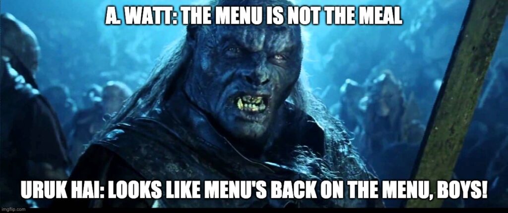
Alfred Korzybski was the first to say, “the map is not the territory.” Alan Watt perhaps made it more clear when he remarked, “the menu is not the meal.”
In history, especially, maps are traditionally authoritarian historical documents: silence-creating in their omissions, dictatorial in their definitions.

In history, we are far more familiar with these maps of definition, not of guidance. Or perhaps better to say that conceptual guidance is being performed here, not physical. Maps are performing a representation of reality, not reality itself.
So how to use this tool?
Well, we’ve had a similar conversation before.
Are digital maps engaging? Yes. Easily misleading? Also yes. Aesthetically appealing? Depends on you. Problematic? Absolutely.
And as with all digital humanities, so painfully fleeting. The broken links of the Peutinger Map are a clear demonstration of digital mapping’s downsides.
But on a more subtle note, consider the massive “Blank Spaces” of the Fraga project, Digitally Mapping Commercial Currents. To my mind, this is the yawning trapdoor of mistaking a map for the territory, or information for reality.
Fraga is diligent in noting the shortcomings of his dataset, but these omissions are not represented in his visualizations or his maps. No ghost routes on the map, no hazy shadows on the graphs, hinting at the tremendous known unknowns.
It’s a problem, for sure. And I don’t have an accessible solution. I also doubt that these negatives outweigh the benefits of a project like Fraga’s, which aims for an academic audience anyways.
Certainly, the earthy reality of the past is related in this story of the customs ledger. Yes, the dull, daily notations of ships and cargos, dates and destinations, but also the wild adventure of it all: the gun-toting customs officers, the landslides, the sealed chest bobbing out to sea for chance salvation by the very vessels omitted in the ledger itself.
And while Fraga mines the collected, quantified data, each of these ledger entries are points of entry upon the past: each ship’s name conceals an epic all of itself, such as the Brother Jonathan, which took both tons of gold bullion and Spokane’s own horse-slaughtering hangman George Wright to their watery grave.

So what makes arcGIS StoryMaps useful? For me, it is this ability (admittedly not leaned into by Fraga) to join the dry, diligently factual world with the fascinating, vivid color of the past experienced.
This magic trick is the bread and butter of popular historians. It’s a technique not limited to GIS, but reliant on that link to reality provided by geography. This reality-linking provides a more tangible hook than that featured in other narrative vehicles we’ve examined (narrative audio and video) because the authorship role itself is reduced.
While authorship is necessary in maps, you don’t have to take my word for it that a geographical feature exists. Today you can confirm it in 2 seconds. You can stand before the Sawtooth mountains, or examine a photo of them, or otherwise confirm their existence to your own satisfaction. The same can’t be said for all historical narratives, which necessarily rely on the logical reasoning, authority, and good intentions of the author. And we all know how that can turn out…
Unlike so much of the internet (and so much bad history) GIS is a tool to tie you to reality. And a well made GIS project can do just that: not pre-empting or re-enacting reality but simply interpreting a small package of it. This may seem unremarkable, but there’s major difference between the conceptual space between your ears, and physical world your body occupies. Tapping that relationship to the physical world is a far surer route to engagement than the conceptual space of an essay or book.
Take the slave cemetery at Mount Vernon. Or the indigenous voices of the Grand Canyon. Here are physical places joined with perspectives, past and present (after all, what’s the difference?) seamlessly intertwined with multimedia presentation constructed upon a profound sense of place.
And how much more powerful is our historical empathy when we recognize a place? Perhaps I know this intersection in San Francisco. Or, I’ve seen this canyon in Nevada. I know these mounds beside an interstate in St. Louis – And I actually have visited Cahokia, and wished I had something like this guide at the time.
The most serious downside (besides those above-listed faults of digital visualizations) is that each arcGIS StoryMap can and should continue the immersion process. Add the map, then add the photos. Then add the video. Then why not add audio? Why not add virtual or augmented reality? Keep going, until I’m wholly immersed in the past, experiencing that reality in dimensions beyond a sense of place.
This sort of accessible, immersive interpretation is my sincere hope for the future of digital history. It’s also how I see museums and historic sites opening their doors to self-educating visitors in a manner more engaging than the traditional website and slideshow.
Like every other tool we’ve encountered, this is hardly the ultimate one. But arcGIS StoryMaps does perhaps the best job so far of pairing the accessible with the academically rigorous.
I like how you pointed out how digital humanities has allowed a certain democratization of maps and data. Simultaneously, as you said, it’s important to understand that things such as historical narratives and logical reasoning aren’t always so easy to create. Great post!
Peter, as always, man…I really enjoy the quality and precision to detail you take with your blog posts. Love the inclusions of hyperlinks, when you are discussing topics, and the hyperlinks when you discussing physical references (halfway through your post). You really should be a writer, voice commentator, or like get paid to do podcasts. If ever meet anyone who does that, I will put in a good word for you!